
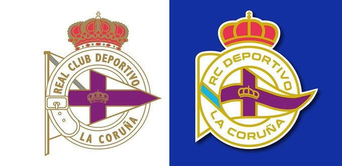
The new shield of RC Deportivo de La Coruña


In modern football there are more and more cases of shields that become logos. The new emblem of Deportivo de la Coruña could be next.
After the controversy generated by the change of Atletico Madrid crest, that did not like anything among the mattress fans, there have been many who have continued with this “modernization”. Deportivo Alavés o Real Valladolid are some of the most recent examples.
The emblem of Deportivo de la Coruna is one of the most recognizable of our football. The Galician team maintains a classic emblem, but nevertheless, as it happens with the rest of clubs, its possible modernization is an issue that is on the table.
Are you in favor of modifying the Dépor shield??
🔃 No.
❤️ yes.
Design: @trymedesign pic.twitter.com/nXRDsZSbUY
— The Depor Today (@eldeportoday) September 25, 2019
As it usually happens in these cases, opted for a simplification of the classical model, eliminating ‘complications’ and moving on to more basic and simple lines. With all this, designs begin to circulate that could be close to the one chosen to be stamped on the t-shirts of the Depor.
These types of changes and decisions are not usually liked by the fans. As we said at the beginning of the article, one of the most mobilized, with little success, It is that of Atlético de Madrid. There are many who advocate returning to the classic shield and totally reject the new 'logo'.
But nevertheless, like it or not, football clubs are, for a few years, companies and, Unfortunately, corporate image is very important. The pompous and complicated shields are giving way to much simpler and more visual logos. Some will like it more and others will like it less., but all hobbies are destined to suffer this 'modernization’ that hurts so much in sight but to which you end up getting used to.